← All work [ Case study 02 · EazyPeazzy ]

A trusted local marketplace for construction and home services.

How a single-company contractor website in Greater Noida became a location-aware platform for customers, local businesses and the team that keeps them honest.

Concept redesign4 surfaces2026
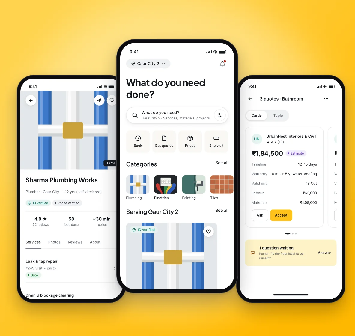
EazyPeazzy — key screens
Role
Product designer · research, UX, UI, prototyping
Platforms
Website · customer app · partner app & portal · admin
Type
Concept redesign · sample content
Year
2026
[ 01 ] Overview

From a contractor’s brochure site to a two-sided marketplace.

A concept project. Research is planned, not yet run; every screen uses sample content.

01

Context

A 15+ year local construction business (as stated on its About page) with 8 trades, a cost calculator and a hyper-local customer base.

02

The problem

Customers can’t tell who serves their address, what a job costs or what happens after they call. The site sells one company’s services, with no prices, status or comparison.

03

The solution

A location-aware marketplace across four surfaces: customer website and app, a Hindi-first partner app and portal, and an admin console.

How might we

How might we help homeowners find businesses that actually serve their address, see what a job will cost and follow it to completion?

[ 02 ] Discover

What the current site gets wrong — and right.

An audit of eazypeazzy.com (1 Oct 2026), a heuristic review and a desk scan of competitors.

  1. 01

    Worth keeping

    The yellow-and-ink heritage, 8 real trades, a cost-estimator idea, WhatsApp and phone.

  2. 02

    Content that erodes trust

    Placeholder contact details, template projects and stock photos shown as completed work.

  3. 03

    Heuristic review

    No reference, status or response time after a form, and hidden prices — both rated high severity.

  4. 04

    Nobody owns the whole project

    Home-service apps, local directories and material suppliers each cover one part of a homeowner’s job.

[ 03 ] Users

Two sides, four people.

Proto-personas from the audit and the local context. Names and quotes are illustrative.

Customer

Priya Mehta

Homeowner · 2BHK, Gaur City 2
I just need someone reliable who turns up when they say and doesn’t change the price at the door.
Customer

Rohit & Anjali Verma

Building a G+2 house · Gaur Yamuna City
Twenty decisions a week. I want prices I can compare and one place to track who said what.
Provider

Sunil Gupta

Material shop owner, Bisrakh · 22 years
If the phone brings more customers I will use it — but I can’t sit filling forms.
Provider

Imran Khan

Independent electrician · one helper
Give me jobs near me, and let my good work speak for itself.
[ 04 ] Principles & structure

Design goals every screen was checked against.

  1. 01Serviceability first — location before search results.
  2. 02Honest prices — every price type labelled.
  3. 03One next step — one primary action per screen.
  4. 04Readable trust — badges say what was checked.
  5. 05Hindi and English, everywhere.
  6. 06Calm and spacious — whitespace over boxes.
User flow
Set locationSearchCompareBook · quote · price · visitTrack statusApprove changesPay & review
Information architecture
Location (global)ServicesMaterialsProjectsStorefrontsAccountFor businessesPartner portalAdmin
[ 05 ] Key decisions

Six decisions that shaped the product.

Decision 01

Serviceability before search

The problem

Customers fall for a provider, then learn they don’t cover their society.

What I did

Location — society, tower or pincode — is the first question and becomes global state. Providers who can’t reach the address never appear.

Why it works

It removes the most disappointing dead end and makes every price and slot real.
Decision 02

Four honest ways to engage

The problem

A leaking tap and a G+3 house went through the same 7-field form.

What I did

Every offering declares a model: Book, Request quotes, Get price, or Book a site visit.

Why it works

Customers know what answer they’ll get; providers never fake a price.

Decision 03

One comparable quote format

The problem

Every contractor quotes differently, so quotes can’t be compared.

What I did

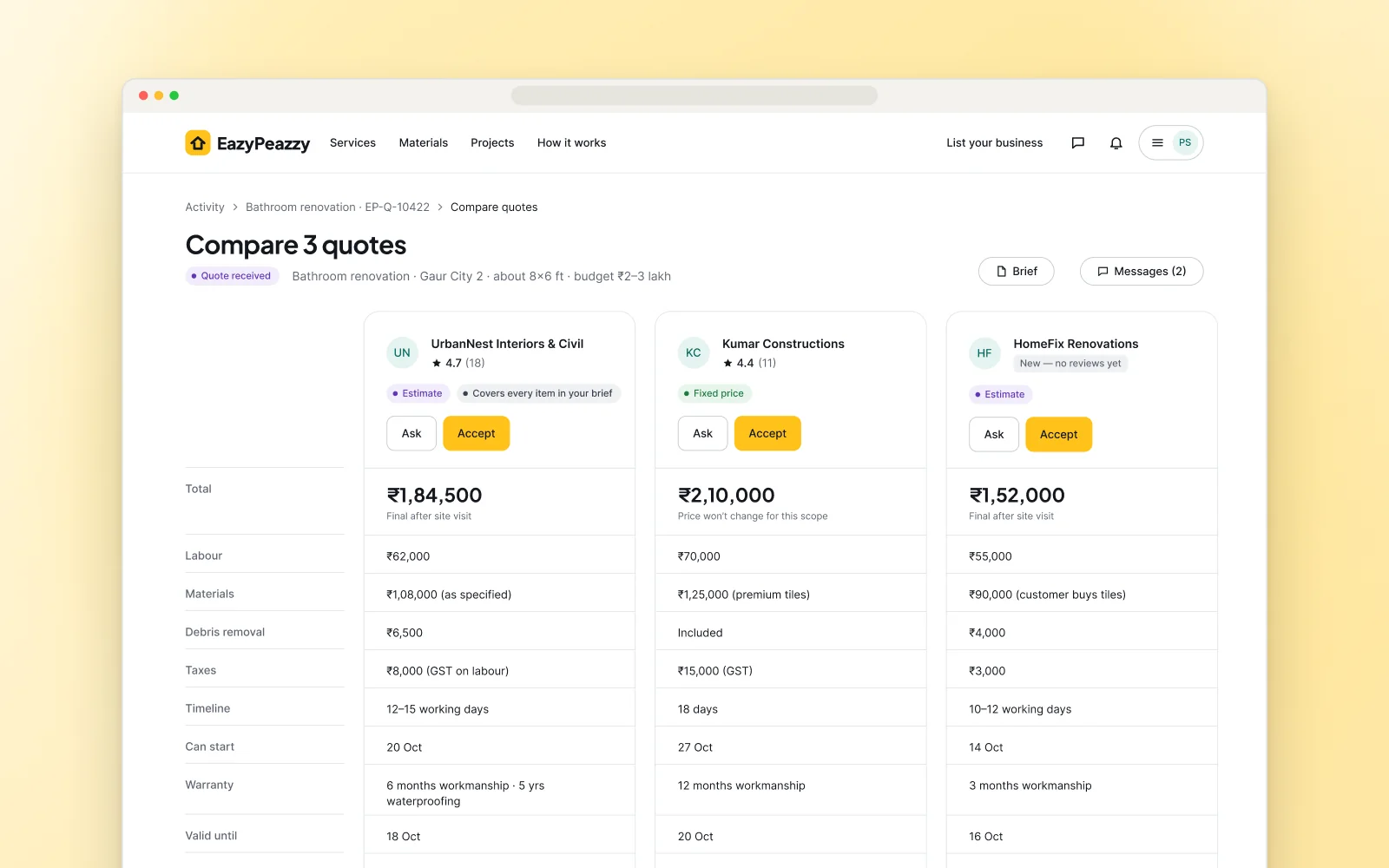
A structured quote builder, shown side by side: total, labour, materials, timeline, warranty, exclusions, validity.

Why it works

The hardest decision becomes a scan across rows.

Decision 04

Price changes need approval

The problem

Prices change at the door, with nothing in writing.

What I did

The pro proposes a change with a reason and photo; the customer approves or declines in the app.

Why it works

Flexibility for real surprises, without the power imbalance at the door.

Decision 05

Verification you can read

The problem

Generic “verified” badges hide what was actually checked.

What I did

Each label names the check — phone, ID, business documents — with a date, backed by an admin audit log.

Why it works

Customers calibrate trust; EazyPeazzy only claims what it can show.

Decision 06

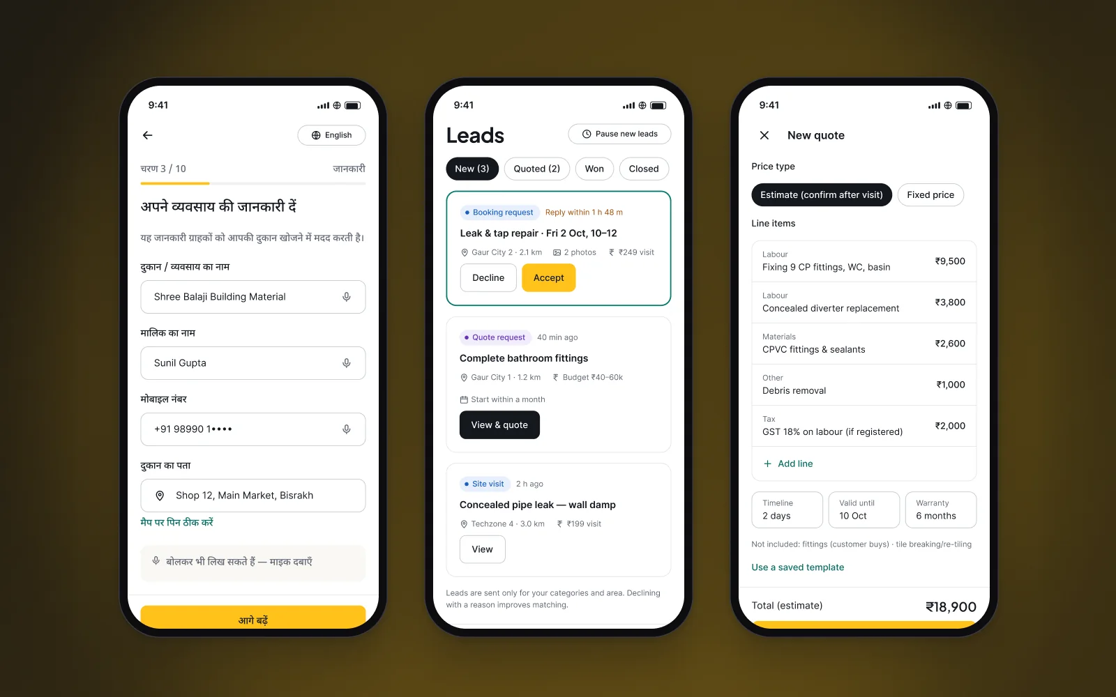
Hindi-first, resumable onboarding

The problem

A shop owner with 22 years in the trade won’t fill a long English form.

What I did

Phone + OTP, Hindi by default, photo-first, saved after every step.

Why it works

Supply is the hardest side of a local marketplace; onboarding is built for it.

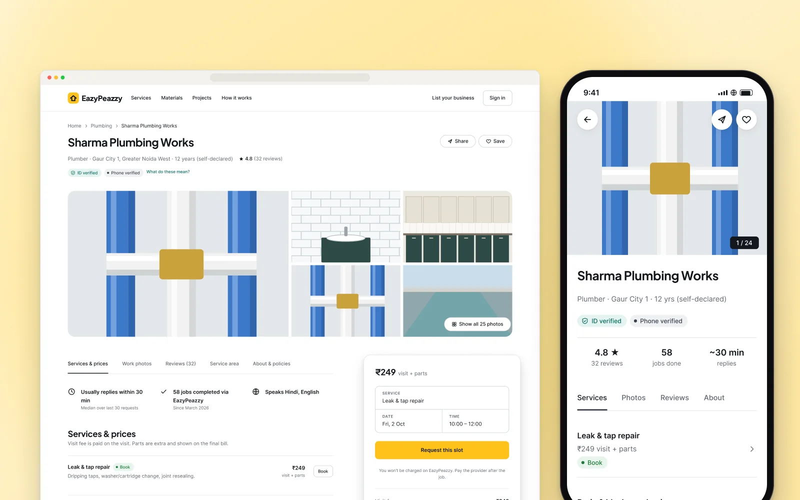
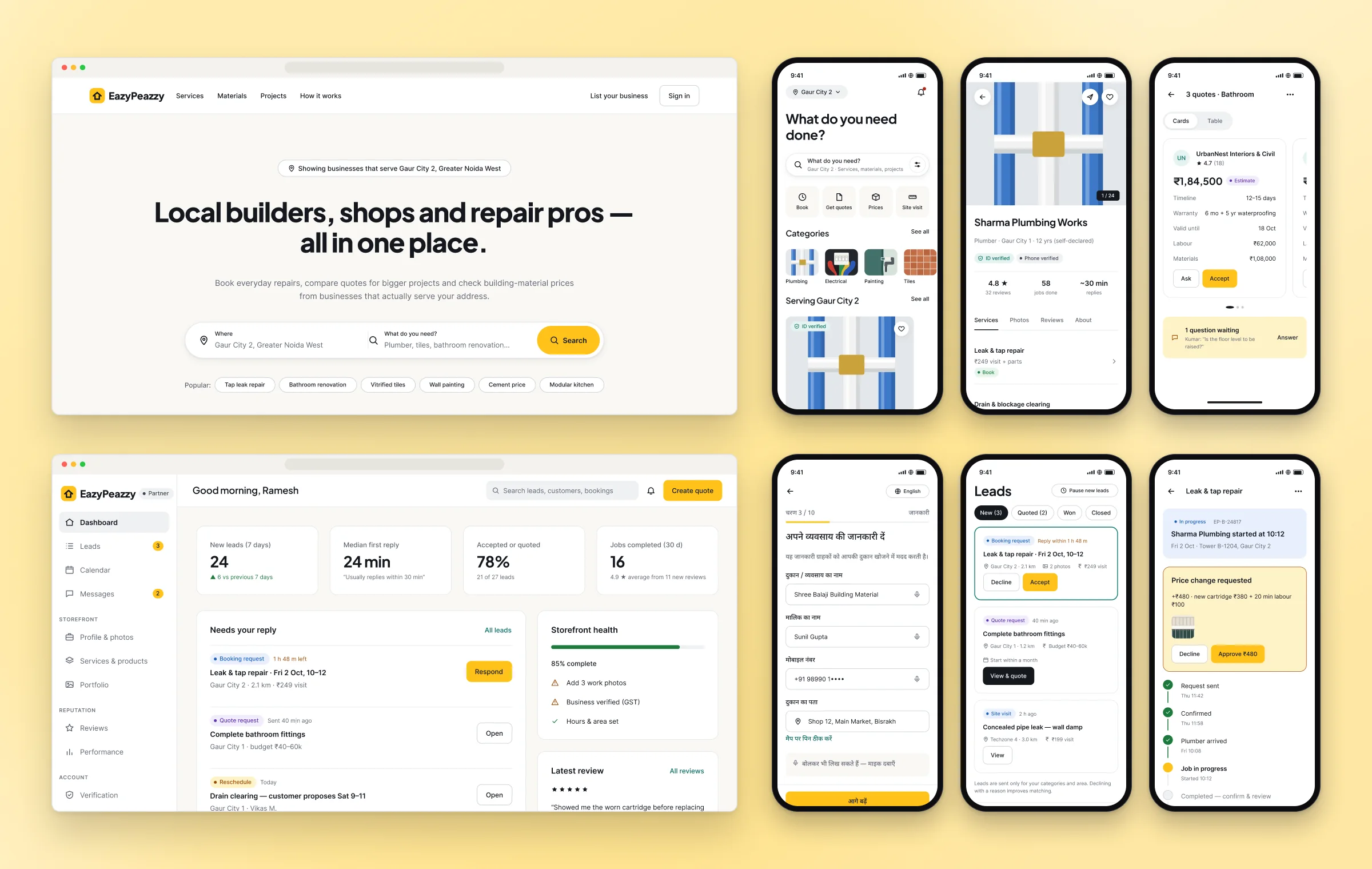
Final designs — customer website, partner dashboard, customer app and the Hindi-first partner app · sample content

Final designs — customer website, partner dashboard, customer app and the Hindi-first partner app · sample content

[ Closer look ]
One storefront, on web and app.
01 / 03One storefront, on web and app.Verified badges, real reply times and a clear visit fee, so a customer can judge a local pro before booking.
A partner app that speaks Hindi.
02 / 03A partner app that speaks Hindi.Onboarding, a lead inbox and a quote builder for small businesses that run everything from one phone.
Quotes you can actually compare.
03 / 03Quotes you can actually compare.Labour, materials, timeline and warranty side by side — so a bigger job isn’t decided on the total alone.
[ 06 ] Iteration & system

Two rounds of iteration, and a system that made them cheap.

  1. Iteration 1

    Whitespace and clarity

    The UI looks very congested.

    More space between and inside sections, fewer items per row, and every board re-laid out so screens can breathe.

  2. Iteration 2

    Five distinct directions

    All 34 website screens restyled five times from the same tokens and content. Recommendation: lead with D5 Guided Planner and borrow D2’s map — to confirm in prototype tests.

  3. Design system

    Tokens made exploration cheap

    Primitive and semantic colour variables, five theme sets, 40+ components and bilingual type with Noto Sans Devanagari.

[ 07 ] Outcomes & reflection

How we’ll know it works.

No results yet. Targets will be set after a two-week concierge pilot.

North star & next steps
  • North star: jobs completed through EazyPeazzy each week, in served areas
  • Funnel: search → request → reply → booked → completed → reviewed
  • Zero-result searches, time to first reply, live providers per area
  • Weeks 0–3: fix site content, interviews and prototype tests
  • Then an MVP: customer web and PWA, partner portal, admin
What I learned

Honesty is a design material

Labelling prices, verification and sample content honestly shaped more screens than any visual choice.

Supply is half the product

The partner app got as much care as the customer site.

States before screens

Designing lifecycles first meant every screen could answer “what happens next?”.