← All work [ Case study 06 · Upgame ]

Turning golf data into reports coaches and golfers can act on.

At Upgame I design across the product: coach reports on the web, the golfer app, and the emails that connect them. This case covers performance reporting and the golfer app.

Web · Mobile · Email2026
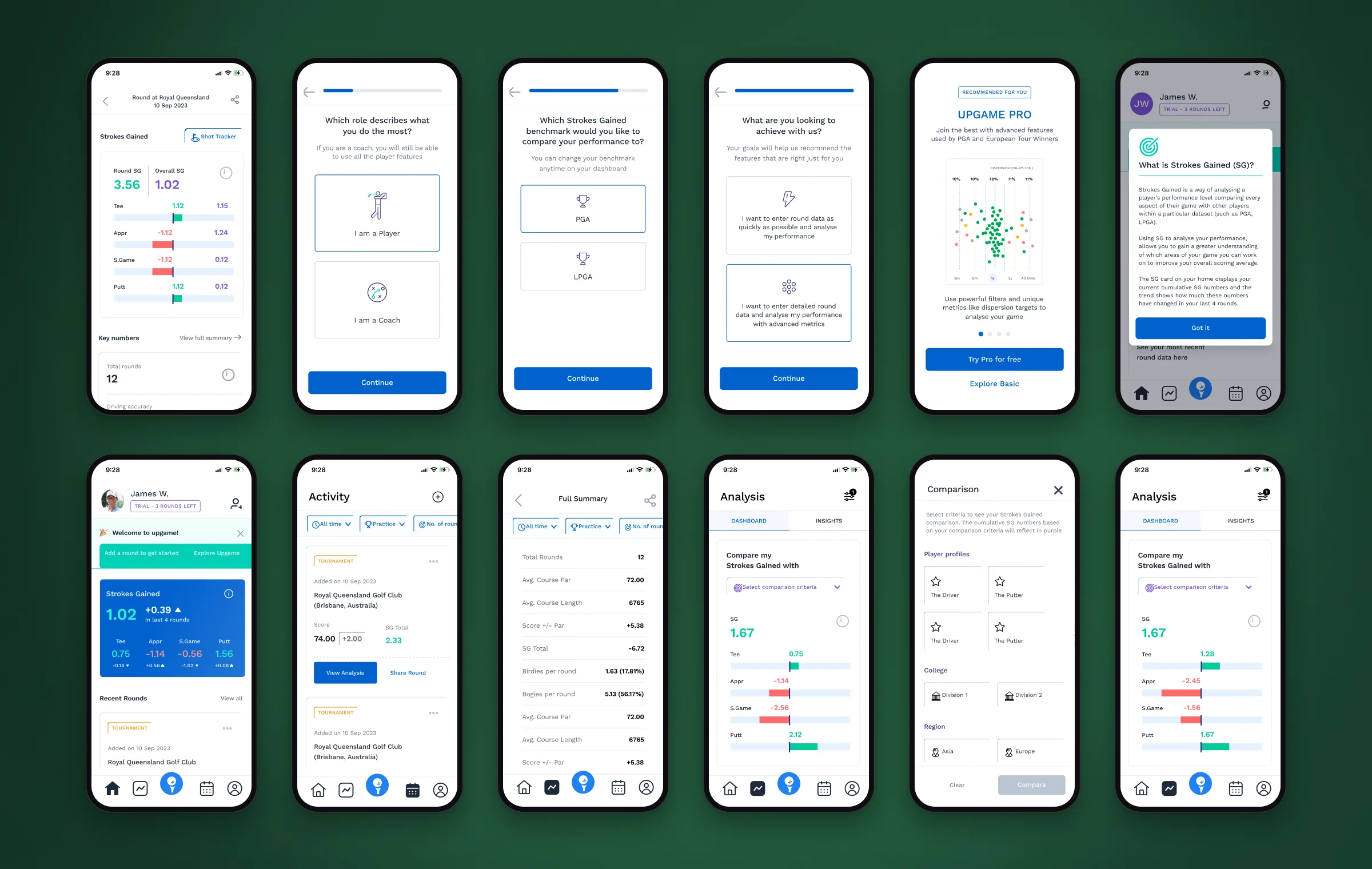
Upgame — key screens
Role
Associate Product Designer, UI/UX
Timeline
Feb 2026 — present
Platform
Web · Mobile · Email
Tools
Figma · Mailchimp
[ 01 ] Overview

Statistics are dense. Improvement should be obvious.

01

The problem

Golf statistics are dense. Golfers struggle to see improvement; coaches lose time assembling data.

02

What I did

Designed coach reporting, the golfer app’s core flows and reusable patterns shared with marketing.

03

Outcome

Reports that lead with meaning — gains in green, losses in red, strengths and next steps up front.

How might we

How might we help golfers understand their performance — and coaches act on it — without drowning either in statistics?

[ 02 ] Context

Analytics, coaching and marketing in one ecosystem.

  1. 01

    Analytics that stay readable

    Complex analytics had to stay easy to understand for golfers of every level.

  2. 02

    One visual language

    Product and marketing needed to feel like the same brand at every touchpoint.

  3. 03

    Two audiences, one dataset

    Golfers and coaches needed different experiences from the same data.

[ 03 ] Users

Three people, one journey.

Primary user

Golfer

Goals — track progress; improve scores

Pain points — complex statistics; hard to measure improvement

Secondary user

Coach

Goals — compare players; personalise coaching

Pain points — scattered player data; time-consuming analysis

Internal user

Marketing team

Goals — communicate value; launch quickly

Pain points — inconsistent assets; a manual design process

[ 04 ] Principles & structure

Reports sit in the middle of the journey, so they carry most of the weight.

  1. 01Visualise before numbers — the pattern first, raw figures second.
  2. 02Keep golfers motivated — celebrate progress.
  3. 03One ecosystem — product, emails and marketing feel like one brand.
User flow
Play roundPerformance capturedAnalytics generatedCoach reviewTraining planProgress tracking
Information architecture
DashboardPerformanceAnalyticsRoundsTrainingCoach InsightsLeaderboardNotificationsProfile
[ 05 ] Key decisions

The decisions that mattered most.

Decision 01

Start from the roster

The problem

Coaches assembled data player by player.

What I did

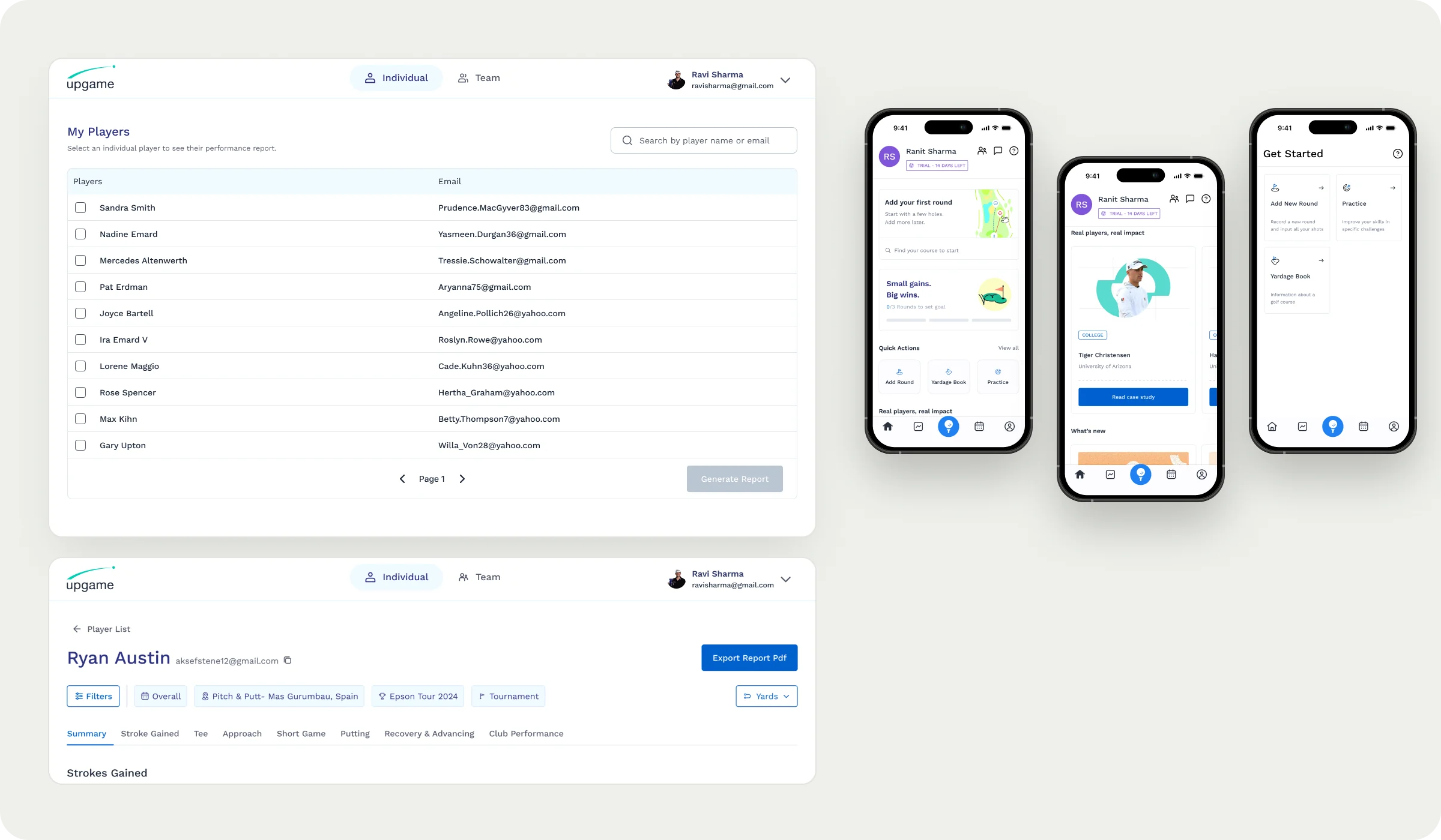
A searchable player table scales to a full roster; multi-select builds comparative reports in one action, and an Individual / Team toggle keeps two mental models in one product.

Why it works

Coaches build reports straight from the roster.
Decision 02

Reports that read at a glance

The problem

Dense statistics hid whether a golfer was improving.

What I did

Strokes Gained leads with colour — green gains, red losses. Strengths and Opportunities frame the data as next steps; tabs drill into every part of the game.

Why it works

Meaning comes first; detail is one tab away.

Decision 03

A golfer app that guides the first round

The problem

New golfers had nothing to look at until they logged rounds.

What I did

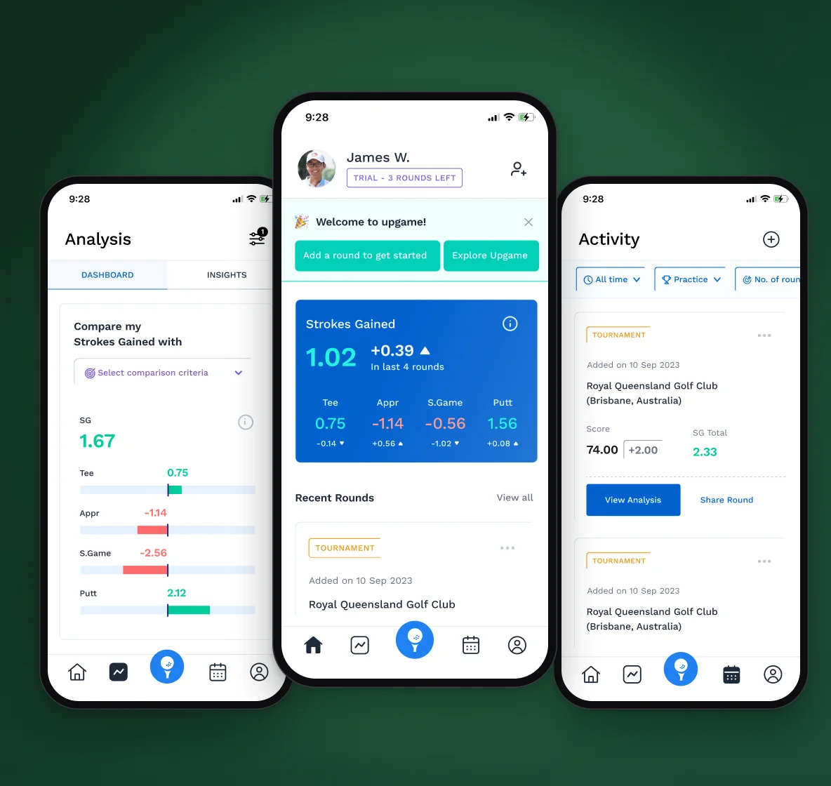
A friendly empty state and a 0/3 rounds goal turn onboarding into a clear first action. Add Round, Practice and Yardage Book map to intent, with large targets.

Why it works

The first action is obvious — and usable one-handed on course.

Decision 04

Shared patterns across product and marketing

The problem

Marketing assets were inconsistent and slow to make.

What I did

Stat cards, charts, player cards and email modules built as one shared set of patterns.

Why it works

Faster delivery and one consistent brand.

Final designs — coach reports on the web, round summary and the golfer app

Final designs — coach reports on the web, round summary and the golfer app

[ Closer look ]
The golfer app, end to end.
01 / 03The golfer app, end to end.Onboarding, plan recommendation, home, activity, round summary and Strokes Gained analysis.
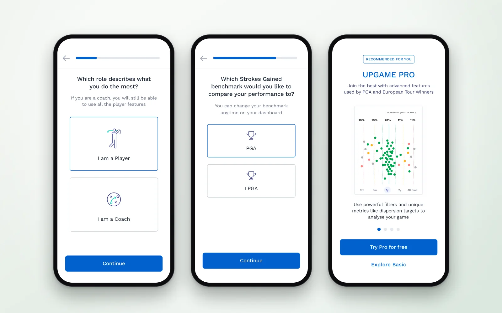
Onboarding that picks the right plan.
02 / 03Onboarding that picks the right plan.Role, benchmark and goal shape the dashboard and the plan we recommend — player or coach, PGA or LPGA.
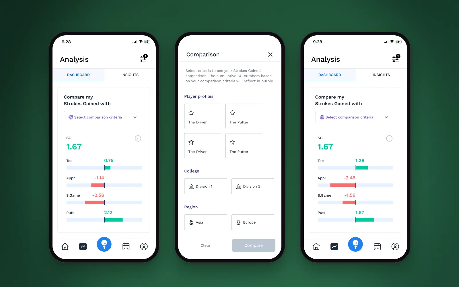
Compare Strokes Gained, side by side.
03 / 03Compare Strokes Gained, side by side.Choose a benchmark — tour profiles, college divisions or region — and see exactly where shots are gained or lost.
[ 06 ] Iteration & system

One journey across report, app and email.

  1. Shared patterns

    One library for product and marketing

    Stat cards, charts, player cards and email modules used across product and marketing, so launches move faster and look consistent.

  2. Email as product

    Designing the whole journey

    Designing the report, the app and the email as one journey made each of them clearer.

[ 07 ] Outcomes & reflection

A shared set of patterns across product and marketing.

Outcome
  • Stat cards, charts, player cards and email modules shared by product and marketing
  • Faster delivery and a consistent brand
  • Next: personalised practice plans
  • Next: coach collaboration and performance predictions
What I learned

Product design extends beyond screens

Designing the report, the app and the email as one journey made each of them clearer.